
New Range Rover logo
- Jul 10, 2025
- 2 min read

Is it a bold move or branding blunder?
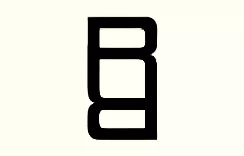
Another week, another automotive rebrand. This time, it's Range Rover stepping forward with a bold new emblem – though it’s not to replace the iconic Range Rover oval logo. Instead, this new logo, made up of two mirrored “R”s, is intended for more limited applications, like event spaces, small-format branding, and perhaps even integrated patterning on interiors or materials.
At first glance, it feels wrong, historically Range Rover has been a symbol of refined prestige, the original luxury SUV that didn’t need to shout (that’s before everyone had one). This new logo, however, leans towards something far more fashion-forward. It wouldn’t feel out of place on designer luggage or a boutique label, is it trying to look like Goyard or Louis Vuitton?
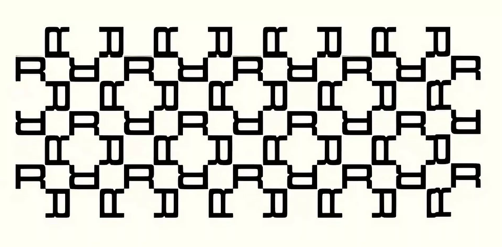
So could the pattern be seen on the grille of the flagship SUV? Perhaps. Woven into upholstery patterns, embossed into EV tech interfaces, or used subtly in physical retail settings?
Range Rover has clarified this isn't a logo redesign, but part of a broader House of Brands strategy from JLR (Jaguar Land Rover), separating Jaguar, Defender, Discovery, and Range Rover into distinct identities.
With electric models on the horizon and an evolving customer base, maybe this is their way of introducing a new design language without abandoning the old one entirely.
For now, the wordmark and oval badge remain. This emblem is more of a whisper than a shout (maybe we’ll hardly see it at all), it’s a visual accent rather than a full rebrand.
As a designer, I’m all for evolution, but I also believe luxury is in the detail. Whether this becomes a subtle statement or another divisive misstep (Jaguar’s rebrand, anyone?), only time will tell.


Interesting update—the new Range Rover logo shows how even established automotive brands continue to evolve their visual identity to reflect modern design trends and reinforce their luxury positioning. Changes like this are part of broader branding and product strategies that involve designers, engineers, and marketing teams working together to ensure consistency across vehicles, digital platforms, and promotional materials. In complex industries like automotive manufacturing, effective project management in manufacturing industry is essential to coordinate teams, keep production timelines on track, and ensure that design updates, engineering changes, and launches are delivered smoothly and efficiently.
This article regarding the new Range Rover logo is quite enlightening. It illustrates how careful design can improve brand identity. In a similar vein, certain students look to pay someone to take my test, and with assistance from Us online class taker, navigating difficult assessments becomes easier while still facilitating effective learning.
It is an amazing logo, and the theory behind this logo perfectly fits it. As the same our children's illustrators convert writing theory into design art, whether it is logo design or any other design.