

Why typography is becoming the star of brand design

More than just choosing a font
When thinking about what makes a brand recognisable, the first things that often come to mind are its logo, colours or perhaps a particularly memorable advertising campaign. However, there is another important part of visual identity that can have just as much influence on how a brand is perceived: typography.
Typography in branding has become an increasingly important consideration for businesses looking to establish a distinctive visual identity. From the lettering used in a logo to the fonts appearing across advertising, websites, packaging and social media, the way a brand presents its written content can say a great deal about its personality, values and positioning.
It is also something that can be easy to overlook. A typeface might initially appear to be a relatively small design decision, but the difference between a bold, geometric sans serif and a traditional serif font can completely change the impression a brand creates. One might communicate confidence and modernity, while another could suggest heritage, craftsmanship or sophistication.
Some of the world's most recognisable brands understand this particularly well. Ferrari, Gucci and adidas have all developed distinctive approaches to typography, using lettering and carefully considered type systems to reinforce their identities. More recently, football clubs such as Como 1907 have also demonstrated how typography and wider graphic design can help create a visual identity that extends well beyond the traditional club badge.
So why is typography becoming such an important part of modern branding, and what can businesses learn from the brands getting it right?
Why is typography important in branding?
Typography is not simply about making words look attractive. It is about deciding how those words should communicate and how they contribute to the overall identity of a business.
Every typeface has its own characteristics. Serif fonts, with their small decorative strokes, are often associated with tradition, authority and elegance. Sans serif fonts tend to offer a cleaner, more contemporary appearance, while heavier or more experimental lettering can introduce personality and make a stronger visual statement.
These associations are not fixed rules, and the way a typeface is perceived will depend on how it is used. However, they demonstrate why choosing the right typography requires more consideration than simply selecting something that looks appealing.
A brand targeting a luxury market, for example, might take a very different approach to a sportswear company or an automotive manufacturer. The typography needs to reflect the audience, the positioning of the business and the wider experience it wants to create.
This is where brand typography becomes particularly valuable. Rather than treating fonts as separate design choices, businesses can develop a consistent typographic style that works across all their communications. This creates familiarity, helps establish recognition and gives customers another visual element through which to identify a brand.
It is also important to consider how typography works alongside other elements of a visual identity. A carefully designed logo might establish the initial impression, but the typography used across a website, brochure or advertising campaign helps carry that identity through every interaction.
Ferrari: How lettering can become part of a brand's heritage
Few automotive brands have an identity as recognisable as Ferrari. Its Prancing Horse emblem, distinctive yellow background and association with Italian motorsport have helped establish a visual identity that is recognised around the world.
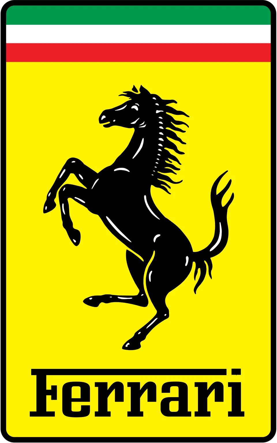
However, an equally interesting part of Ferrari's branding is its wordmark.
The Ferrari lettering is distinctive in its own right. Its custom-designed letterforms, proportions and unusual treatment of the capital F give the wordmark a personality that is difficult to confuse with another automotive manufacturer.
Rather than relying on a standard typeface, the lettering has become a recognisable piece of the brand's visual identity. It demonstrates how typography can move beyond simply displaying a company name and become an asset in its own right.
There is also a strong relationship between the lettering and Ferrari's wider heritage. The brand has spent decades establishing an association with performance, engineering and motorsport, and its visual identity reflects that positioning. The wordmark feels confident and purposeful, complementing the characteristics associated with its cars.

What makes this particularly interesting from a design perspective is the consistency. While brands need to evolve to remain relevant, there is considerable value in retaining elements that audiences already recognise. Ferrari has refined its visual identity over time without losing the characteristics that make it distinctive.
It is a good example of how custom typography and considered lettering can contribute to long-term brand recognition.
The lesson for other businesses is that typography does not always need to be complicated or constantly reinvented. Sometimes, creating something distinctive and applying it consistently is what makes it successful.
Gucci: How typography communicates luxury and heritage
Moving from automotive design into luxury fashion, Gucci provides another interesting example of how typography can influence the way a brand is perceived.

Founded in Florence in 1921, Gucci has built its identity around Italian craftsmanship, fashion and a strong connection to its heritage. Its visual identity has evolved considerably over the decades, but its wordmark remains one of its most recognisable features.
The classic Gucci wordmark uses serif lettering, with carefully considered proportions and spacing that give it a refined appearance. The individual letters are relatively restrained, allowing the name itself to carry the visual impact.
This is an interesting contrast to brands that rely on elaborate symbols or highly decorative logos. Gucci demonstrates that typography can be powerful without needing to dominate a design through complexity.
The use of serif lettering also helps create associations with tradition and sophistication. These characteristics complement the brand's luxury positioning and its history within the fashion industry.
However, Gucci's approach to typography becomes even more interesting when looking at how its visual identity has changed over time. The brand has experimented with different creative directions, adapting its presentation to reflect changing audiences and fashion trends while retaining recognisable elements of its identity.

This highlights an important point about brand identity design. Consistency does not necessarily mean keeping everything exactly the same forever. It means understanding which elements are fundamental to recognition and knowing how to evolve the surrounding design without losing the identity that has already been established.
For businesses, Gucci is a useful reminder that typography should reflect the character of the brand rather than simply follow whatever happens to be fashionable at the time.
A typeface that works beautifully for a luxury fashion house might be completely unsuitable for a technology company or a construction business. The important thing is understanding what the typography needs to communicate and making sure it supports the wider brand positioning.
adidas: How custom typography creates brand consistency
While Ferrari and Gucci demonstrate how distinctive lettering can become closely associated with a brand, adidas provides a particularly interesting example of how typography can work as part of a much wider design system.

The adidas identity is instantly recognisable through its Three Stripes, Trefoil and Badge of Sport symbols. However, its approach to typography is just as important when looking at how the brand maintains consistency across its different communications.
One particularly interesting example is Adineue PRO, a typeface developed for adidas in collaboration with type designers.
The typeface was created to provide the brand with a recognisable typographic language that could be used across different platforms and applications. Rather than relying on a collection of unrelated fonts, adidas developed a system that could be adapted to different creative requirements while retaining a consistent visual character.

Adineue PRO includes different weights and styles, allowing designers to create contrast and hierarchy within their work. Heavier lettering can provide impact in advertising and campaign headlines, while lighter variations offer a different visual treatment when required.
This flexibility is important for a brand operating across such a wide range of products, audiences and marketing channels. Typography needs to work on everything from large advertising displays and football campaigns to websites, product packaging and social media graphics.
It also demonstrates that typography design is about more than choosing a font that looks good in isolation. It involves considering how that typeface will function across different formats, how it will interact with other design elements and how it can maintain a recognisable appearance regardless of where it is used.
For adidas, typography becomes another way of reinforcing its identity. Even when the logo is not the main focus of a design, the lettering can help create something that still feels connected to the brand.
This is perhaps one of the most valuable lessons for businesses looking to improve their own branding. Developing a considered typographic system can make marketing materials feel more connected, professional and recognisable.
Como 1907: How typography helps build a modern football identity
Football branding has traditionally been centred around club crests, colours and the history associated with a team. However, the modern football landscape has expanded considerably, with clubs increasingly developing wider identities that extend into fashion, lifestyle, merchandise and digital content.

Como 1907 is an interesting example of this changing approach.
The Italian club has developed a distinctive visual presence that draws on its location, heritage and connection to the wider Lake Como area. Its identity is not limited to the traditional football badge.
Instead, it is reflected across promotional material, merchandise, clothing collaborations and social media.
One particularly interesting example is the club's use of archival football graphics and supporter-inspired details within its contemporary merchandise. Its collaborations and collections have brought together elements of football history with modern fashion and graphic design.
This provides an opportunity to look at how typography works alongside other visual elements to create a recognisable identity. The lettering used across promotional graphics, clothing and supporting materials helps establish a particular style, while the wider design language connects the club to its heritage and location.

It is important to recognise that this is not simply about choosing an attractive font. The effectiveness comes from how the different elements work together. Typography, imagery, colour and graphic treatments all contribute to the overall impression.
For Como 1907, this wider approach helps the club communicate something beyond football itself. It creates a visual identity that can appeal to supporters, fashion audiences and people who may have an interest in the culture and lifestyle associated with the region.
There is a valuable lesson here for businesses outside the sporting world, too. A brand does not have to rely entirely on its logo to establish recognition. The way it uses typography across different communications can become just as important in developing a consistent and memorable identity.
How do brands use typography to stand out?
Looking at these four examples, it becomes clear that there is no single approach to successful brand typography.
Ferrari uses distinctive lettering to reinforce its heritage and performance-focused identity. Gucci demonstrates how carefully considered serif typography can communicate luxury and sophistication. adidas shows how a custom typeface can create consistency across a global brand, while Como 1907 illustrates how typography can contribute to a wider identity that connects sport, culture and lifestyle.
Although these brands operate in very different industries, they share an important principle. Their typography is not an afterthought. It forms part of a wider creative direction that has been developed to support their identity.
For businesses, this means thinking beyond the question of which font looks best. It is worth considering whether the typography reflects the personality of the brand, whether it works across different marketing materials and whether it helps distinguish the business from its competitors.
There is also a practical consideration around consistency. Using several unrelated typefaces across a website, social media posts and printed materials can make a brand feel disconnected. Establishing a clear typographic system helps create a more cohesive appearance and makes it easier for audiences to recognise the business.
This does not mean every piece of marketing needs to look identical. There is still room for creativity and experimentation, provided the underlying visual identity remains recognisable.
Why do businesses use custom fonts?
For some businesses, selecting an existing typeface that suits their brand will be more than sufficient. However, others may benefit from investing in custom typography.
A custom typeface can give a brand greater control over how its written identity looks and behaves. It can be designed around specific characteristics, whether that means distinctive letterforms, particular proportions or a style that reflects the personality of the business.
It can also help create something more individual. While widely available fonts are useful and often extremely well designed, they are also accessible to other businesses. A company looking to establish a particularly distinctive identity may therefore consider developing something specifically for its own use.
That said, custom fonts are not automatically the right choice for every business. They require time, investment and careful consideration of how they will be used. A well-chosen existing typeface, applied consistently and thoughtfully, can be just as effective.
The important thing is making a deliberate decision rather than treating typography as a finishing touch once the rest of the branding has been completed.
How can typography make a brand recognisable?
Brand recognition is often built through repetition. The more consistently audiences encounter a brand's visual identity, the easier it can become to recognise and remember.
Typography plays an important role in this process because it appears across so many different brand touchpoints. From website headings and advertising campaigns to brochures, packaging and social media graphics, it provides an opportunity to reinforce the same visual characteristics.
Over time, a distinctive typographic style can become closely associated with a particular business. Audiences may begin to recognise the appearance of its lettering, the way headlines are presented or the relationship between different font weights and styles.
This is particularly valuable when a brand is communicating across multiple platforms. A consistent typographic approach helps create a familiar experience, even when the content, imagery or format changes.
However, recognition should not come at the expense of readability.
Typography needs to work for its intended audience, particularly across digital platforms where people may be viewing content on different screen sizes and devices.
The strongest approach is one that balances personality with practicality. A brand should look distinctive, but its messaging should always remain clear and accessible.
Making typography work for your brand
The examples of Ferrari, Gucci, adidas and Como 1907 demonstrate that typography can play several different roles within a brand identity. It can communicate heritage, establish a particular market position, create consistency or help a business develop a more distinctive personality.
There is no universal formula for getting it right. The most effective approach will depend on the business, its audience and what it wants its visual identity to communicate.
For some companies, this might involve developing a completely custom typeface. For others, it could simply mean selecting two complementary fonts and establishing clear guidelines for how they should be used across marketing materials.
What matters is that the decision is considered and that typography works alongside the other elements of the brand rather than being treated as a separate design choice.
Ultimately, typography in branding is about much more than the appearance of individual letters. It is about creating a visual language that helps people understand, recognise and connect with a business.
The right typography might not always be the first thing someone notices about a brand, but it can be one of the reasons they remember it.
Frequently asked questions
Why is typography important in branding?
Typography helps communicate a brand's personality, values and positioning. The choice of typeface, lettering style, spacing and layout can influence how audiences perceive a business while helping create a consistent and recognisable visual identity.
How does typography influence brand identity?
Typography influences brand identity by creating visual associations with a business. Different typefaces can communicate different characteristics, such as professionalism, creativity, luxury or modernity. When applied consistently, these characteristics help establish a recognisable brand personality.
How do brands use typography to stand out?
Brands use typography through distinctive wordmarks, custom typefaces, carefully selected fonts and consistent design systems. Businesses such as Ferrari, Gucci and adidas demonstrate how lettering can become an important part of a wider visual identity.
Why do businesses use custom fonts?
Businesses use custom fonts to create a more individual visual identity and maintain greater control over how their brand communicates. A bespoke typeface can help distinguish a company from competitors and provide consistency across different marketing platforms.
How can typography make a brand recognisable?
Consistent typography helps audiences become familiar with a brand's visual appearance. When the same typographic characteristics are used across websites, advertising, packaging and social media, they reinforce recognition and help create a more cohesive brand identity.


It's interesting how something as seemingly simple as typography can have such a big impact on how people recognise and connect with a brand. I particularly liked the examples of Ferrari and Como 1907, showing how the right lettering can communicate a brand's personality and heritage. It also reminded me of a related discussion I recently came across on England & Derbyshire Solicitors