
Orson Bros - brand identity
- Apr 30
- 2 min read

From Land to brand: Creating the Orson Bros identity
When Will and Simon Orson were introduced to me, they weren’t coming from a background of branding, marketing, or design – they were farmers, with over 300 years of history behind them, looking to take their first steps into something new.
They had made the decision to diversify into brewing their own beer, using ingredients grown on their land in the Vale of Belvoir, and they understood that in order to do that properly, they needed more than just a product, they needed something that would represent who they are and where they’ve come from.
What they didn’t want was something generic or overly styled They wanted something that felt honest, grounded, and true to them.
That’s where the process began.
Rather than jumping straight into visuals, we spent time talking through their story – the land, the family history, the way they work, and the connection between what they grow and what they are now producing.
It quickly became clear that this wasn’t about creating a “beer brand” in the traditional sense, but about building an identity that could carry their heritage forward into a new direction, without losing what makes it meaningful.
The idea for the logo developed from that thinking.
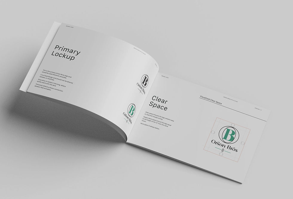
Developing the logo identity

At the centre of it is the ‘O’, which has been designed so that two forms are subtly intertwined within it, representing the two brothers as one, not in an obvious or literal way, but in a way that feels considered and balanced, and reflects the partnership at the heart of the business.
Beneath this, the barley symbol provides a direct connection back to the land itself, referencing what they grow and what ultimately forms the foundation of their beer, ensuring that even as the business evolves, it remains rooted in its origin.
As with any identity, this wasn’t a case of arriving at the final design immediately.
There were sketches, alternative routes, and different ways of approaching the idea, all of which helped refine the direction and strip things back to what mattered most.
The focus throughout was on creating something that would last, something simple, recognisable, and meaningful, rather than something driven by trends or unnecessary detail.
When we arrived at the final design, their response was exactly what you hope for in a project like this.
In their words, it was “a great logo.”
Simple, but genuine.
From sketches to final identity
More importantly, it gave them something they didn’t have before, a clear and confident identity that reflects who they are, supports where they are going, and allows them to present their business properly as it continues to grow.
This wasn’t just about designing a logo.
It was about taking a business built on generations of experience and giving it a visual identity that does it justice.


Brand identity projects like Orson Bros show what happens when every visual element is intentional rather than just aesthetically pleasing for the sake of it. The cohesion between typography, color palette and overall tone tells you immediately what the brand stands for without needing a single word of explanation. Appreciated this kind of deliberate design thinking after experiencing on site forklift training where even the safety signage and branding on equipment followed strict visual standards because clarity in identity is not just a design principle it is a safety one too. Strong brand identity is invisible when done right because it just feels like the business could not have looked any other way.