
The new KFC branding
- 13 hours ago
- 3 min read

KFC’s new rebrand shows why the strongest brands don’t always need reinventing
When most people hear the word “rebrand”, they imagine a completely new logo, a fresh colour palette and a dramatic change in direction. In reality, the most successful rebrands are often much more subtle.
KFC’s latest identity refresh is a perfect example.
If I say “The Colonel”, “Finger Lickin’ Good” or “a bucket of chicken”, chances are you immediately think of KFC. That’s because the company has spent decades building strong brand recognition through a collection of distinctive assets that are instantly associated with the brand.
The challenge facing KFC wasn’t that people didn’t recognise them – quite the opposite.
The challenge was finding ways to modernise the brand while preserving the equity that has been built over many years.

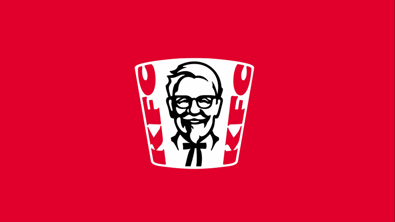
The bucket now takes centre stage
Created with branding agency JKR, the new identity expands far beyond a logo update. The refresh includes a refined visual system, custom typography, restaurant design elements, packaging updates and a new three-dimensional interpretation of the famous KFC logo. However, the most interesting part of the rebrand isn’t the logo at all.
It’s the bucket.

For years, the bucket served primarily as packaging (whilst still being distinctive). It was functional, recognisable and closely associated with the KFC experience, but it wasn’t being fully used as a strategic brand asset. The new identity changes that.
The bucket now acts as a central design device throughout the brand. Its shape influences layouts, graphics, photography, motion design, advertising and in-store experiences. Rather than simply holding the product, the bucket has become part of the visual language of the brand.
Building a brand world
JKR describes the new identity as creating a “Bucketverse” – a complete visual world built around one of KFC’s most recognisable assets.
This approach is becoming increasingly important in modern branding.
Consumers no longer interact with brands in just one place, they see them across social media, websites, apps, packaging, advertising, digital screens and physical environments.
By using the bucket as an element across every touchpoint, KFC has created a flexible framework that can adapt to different formats while remaining instantly recognisable.
Why does this matter?
One of the biggest mistakes businesses make is believing that branding begins and ends with a logo. A logo is obviously important, but it is only one part of a much larger system.
The strongest brands often own a collection of distinctive assets:
The Coca-Cola bottle shape
The Tiffany Blue colour
The Nike swoosh
The McDonald’s Golden Arches
These assets become shortcuts in the minds of customers, people recognise them before they even read the company name.
KFC’s bucket belongs in that category. The company already owned this powerful asset, the rebrand simply acknowledges its value and gives it a larger role within the overall brand strategy.
Evolution, not revolution
Perhaps the biggest lesson from KFC’s rebrand is that successful branding is often evolutionary rather than revolutionary.
KFC hasn’t abandoned its heritage.
It hasn’t discarded decades of recognition.
It hasn’t attempted to become something completely different.
Instead, it has identified one of its strongest existing assets and showcased it. That’s a far less risky approach than starting again, and it allows the brand to feel fresh while remaining familiar.
The takeaway for businesses
Before considering a complete rebrand, it’s worth asking a simple question:
What assets do you already own?
It could be a logo, a colour, a product shape, a slogan, a mascot or even a style of photography, something that is uniquely yours.
The strongest rebrands don’t always create new recognition, often they build upon recognition that already exists.
KFC’s latest refresh demonstrates exactly that. The bucket was always there, the difference is that now it’s doing much more of the branding work.
And that’s not a revolution.
That’s smart branding.


Comments