
New Pizza Hut logo
- Aug 27, 2025
- 2 min read

Pizza Hut recently unveiled a refreshed logo in the UK, a bold move that ditches the pizza-like circle and reintroduces elements from its 1970s identity. And I have a confession to make: for years, I thought the hut was a hat.
Yes, a hat. Not a hut.

Pizza Hut has gone through multiple rebrands since its founding in 1958. The early logos were straightforward typographic designs. But it was the 1974 version, with its now famous red roof that cemented the brand’s visual identity.
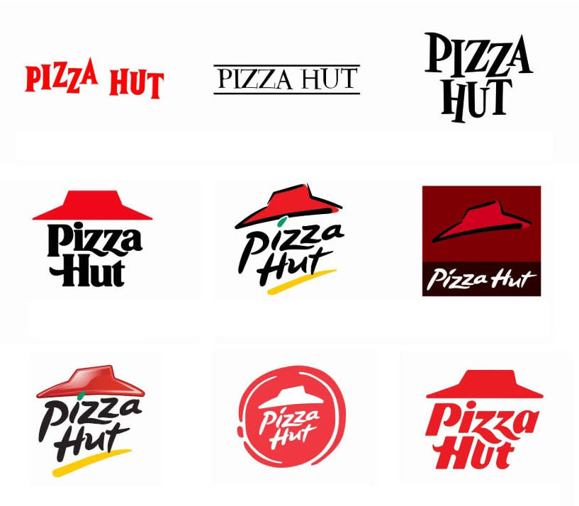
That roof (which still feels like a hat to me) became a constant through the 80s to the current version. More recent designs flirted with trends, the 2014 logo introduced a brushstroke circle, suggesting a pizza base, and a handwritten-style typeface that felt more “craft” than corporate.
The latest version brings a bold, italicised typography with a simplified red roof, much closer to the logos used in the 80s and 90s. The new typeface is bold and confident. The quirky slanted ‘z’ and the curved ‘H’ add a fun dynamic that helps it stand out from the ‘blanded’ geometric, sans-serif logos that so many businesses are doing. It feels more distinctive than its predecessor and importantly, it works much better in small sizes and digital formats.
From a branding point of view, this redesign balances heritage with modernity.
It does three smart things:
1. Recaptures legacy equity – by returning to a familiar roof symbol and layout.
2. Modernises typography – with a vibrant, slanted wordmark that has personality.
3. Improves scalability – great for apps, signage, and social icons.
Hat or Hut – does it really matter? Maybe it was a hut all along (it was). But the fact that many of us saw a hat is a reminder that branding isn’t just about intention, it’s about perception.
Designers can’t always control what people see. What we can do is guide recognition, embrace emotion, and help brands stay relevant without losing their roots.
Good branding evolves. It listens, adapts, remembers its roots, and keeps looking forward. Pizza Hut’s latest refresh might not be revolutionary, but it’s smart, strategic, and refreshingly self-aware.
Like insights like these?
I regularly share brand analysis, design tips, and project stories. Subscribe to the LMRT newsletter or follow me on LinkedIn for more.


This was a very insightful breakdown of the new logo design — the details and reasoning behind each choice were explained very clearly. I recently came across a similar discussion on a review blog, which offered another interesting perspective on branding trends. The approach here reminded me of the way https://www.sherwaytrilliumdental.ca/ shares guidance: thorough, clear, and easy to follow. A well-presented post that is both creative and informative!
Snow Rider 3D perfectly balances accessibility with challenge.